#> ── Attaching core tidyverse packages ──────────────────────── tidyverse 2.0.0 ──
#> ✔ dplyr     1.2.1     ✔ readr     2.2.0
#> ✔ forcats   1.0.1     ✔ stringr   1.6.0
#> ✔ ggplot2   4.0.3     ✔ tibble    3.3.1
#> ✔ lubridate 1.9.5     ✔ tidyr     1.3.2
#> ✔ purrr     1.2.2
#> ── Conflicts ────────────────────────────────────────── tidyverse_conflicts() ──
#> ✖ dplyr::filter() masks stats::filter()
#> ✖ dplyr::lag()    masks stats::lag()
#> ℹ Use the conflicted package (<http://conflicted.r-lib.org/>) to force all conflicts to become errorsSimulation studies
Invalid Date
This vignette shows how to simulate a cross-sectional sample of seroresponses for incident infections as a Poisson process with frequency lambda. Responses are generated for the antibodies given in the antigen_isos argument.
Age range of the simulated cross-sectional record is lifespan.
The size of the sample is nrep.
Each individual is simulated separately, but different antibodies are modelled jointly.
Longitudinal parameters are calculated for an age: age_fixed (fixed age). However, when age_fixed is set to NA then the age at infection is used.
The boolean renew_params determines whether each infection uses a new set of longitudinal parameters, sampled at random from the posterior predictive output of the longitudinal model. If set to FALSE, a parameter set is chosen at birth and kept, but:
the baseline antibody levels (
y0) are updated with the simulated level (just) prior to infection, andwhen
age_fixed = NA, the selected parameter sample is updated for the age when infection occurs.
For our initial simulations, we will set renew_params = FALSE:
There is also a variable n_mcmc_samples: when n_mcmc_samples==0 then a random MC sample is chosen out of the posterior set (1:4000). When n_mcmc_samples is given a value in 1:4000, the chosen number is fixed and reused in any subsequent infection. This is for diagnostic purposes.
1 Simulate a single dataset
1.1 load model parameters
Here we load in longitudinal parameters; these are modeled from all SEES cases across all ages and countries:
1.2 visualize antibody decay model
We can graph individual MCMC samples from the posterior distribution of model parameters using a autoplot.curve_params() method for the autoplot() function:
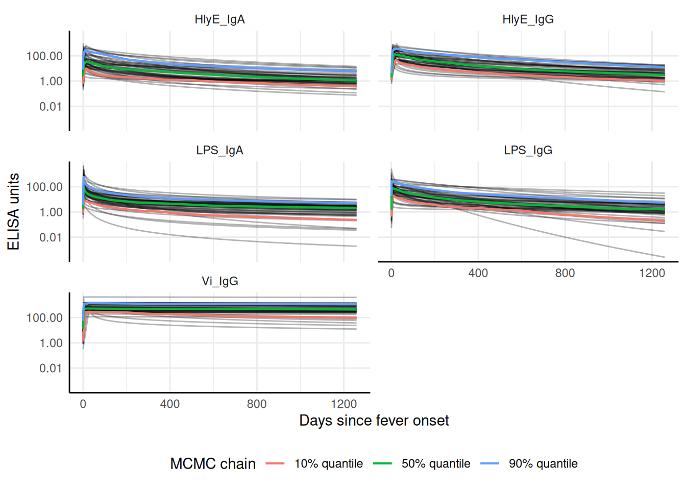
We can use a logarithmic scale for the x-axis if desired:
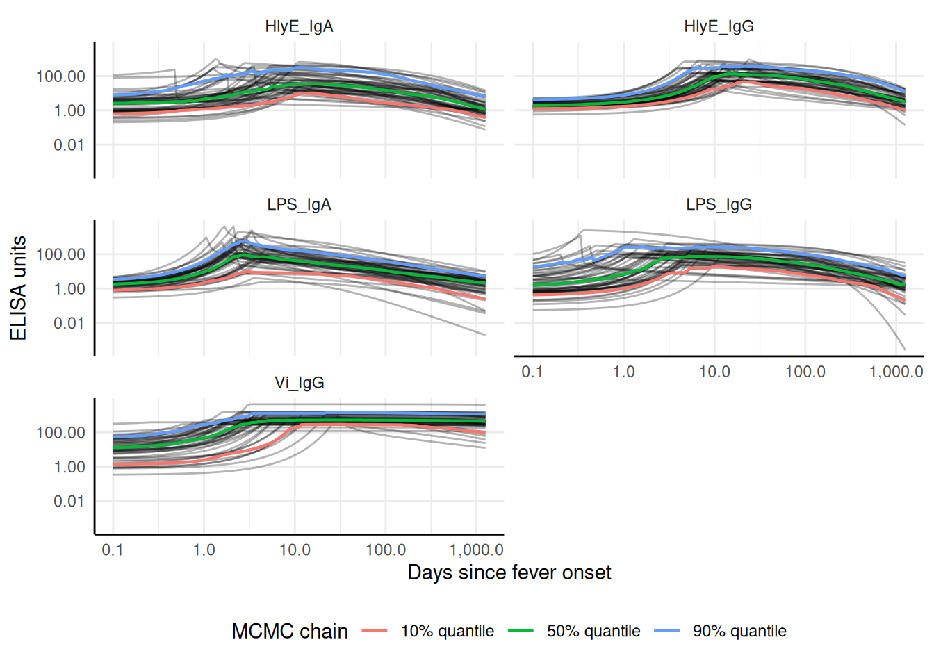
We can add the median, 10%, and 90% quantiles of the model:

1.3 Simulate cross-sectional data
1.4 Noise parameters
We need to provide noise parameters for the analysis; here, we define them directly in our code:
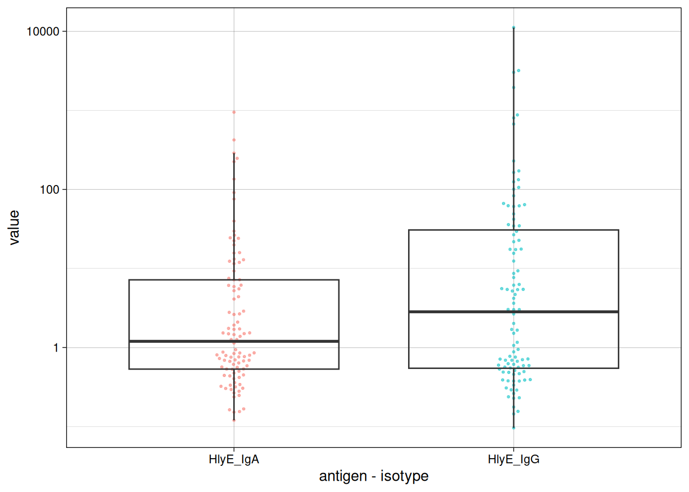
1.5 Visualize data
We can plot the distribution of the antibody responses in the simulated data.
1.6 calculate log-likelihood
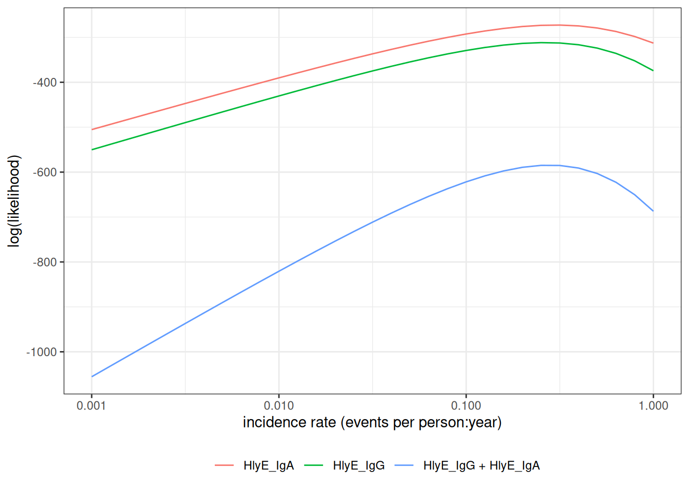
We can calculate the log-likelihood of the data as a function of the incidence rate directly:
#> [1] -292.5068
#> [1] -329.1799
#> [1] -621.6867
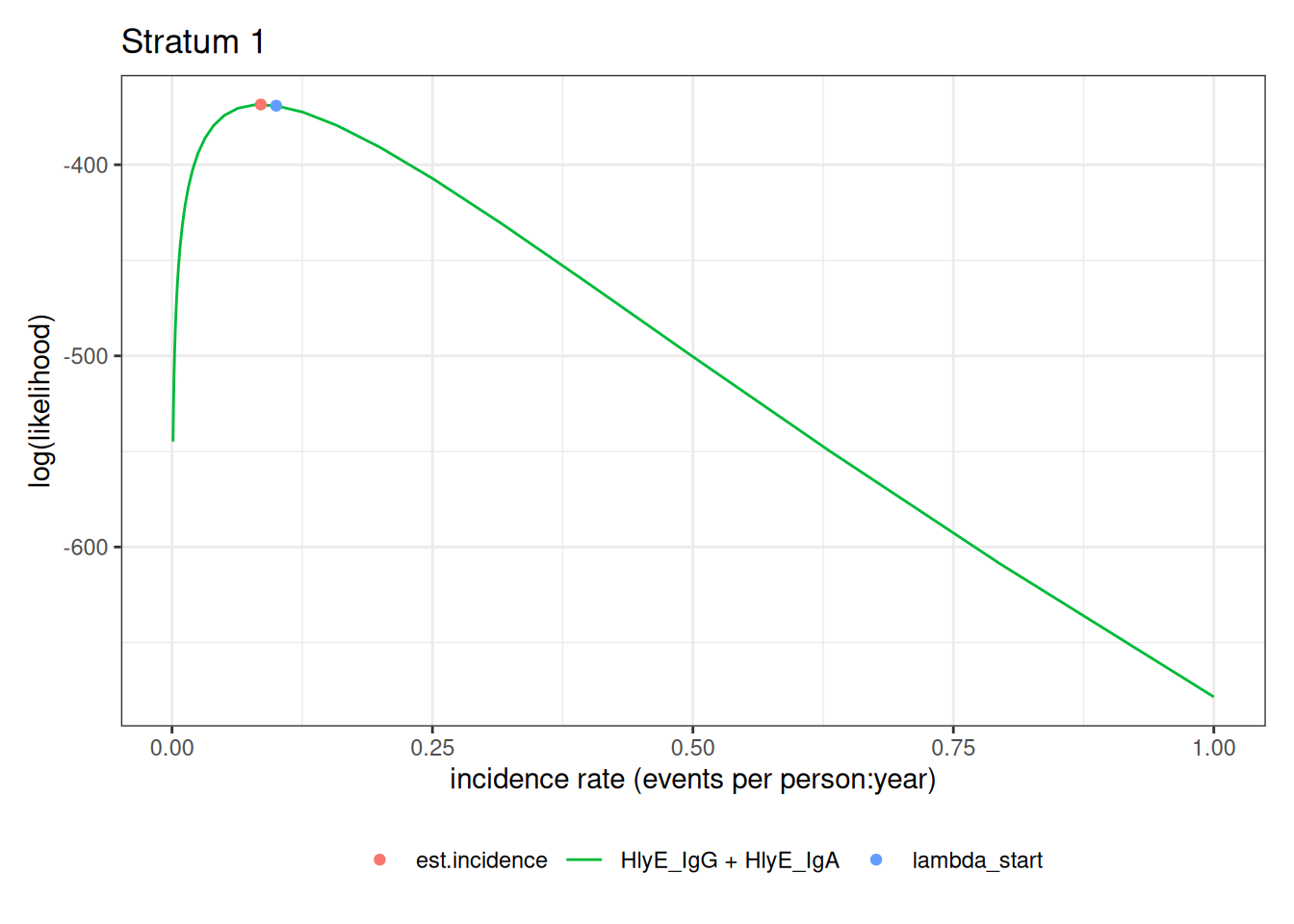
#> [1] -621.68671.7 graph log-likelihood
We can also graph the log-likelihoods, even without finding the MLEs, using graph_loglik():
1.8 estimate incidence
We can estimate incidence with est_seroincidence():
We can extract summary statistics with summary():
#> # A tibble: 1 × 11
#>   est.start incidence.rate     SE CI.lwr CI.upr se_type  coverage log.lik
#>       <dbl>          <dbl>  <dbl>  <dbl>  <dbl> <chr>       <dbl>   <dbl>
#> 1       0.1          0.279 0.0289  0.228  0.342 standard     0.95   -584.
#> # ℹ 3 more variables: iterations <int>, antigen.isos <chr>,
#> #   nlm.convergence.code <ord>
We can plot the log-likelihood curve with autoplot():
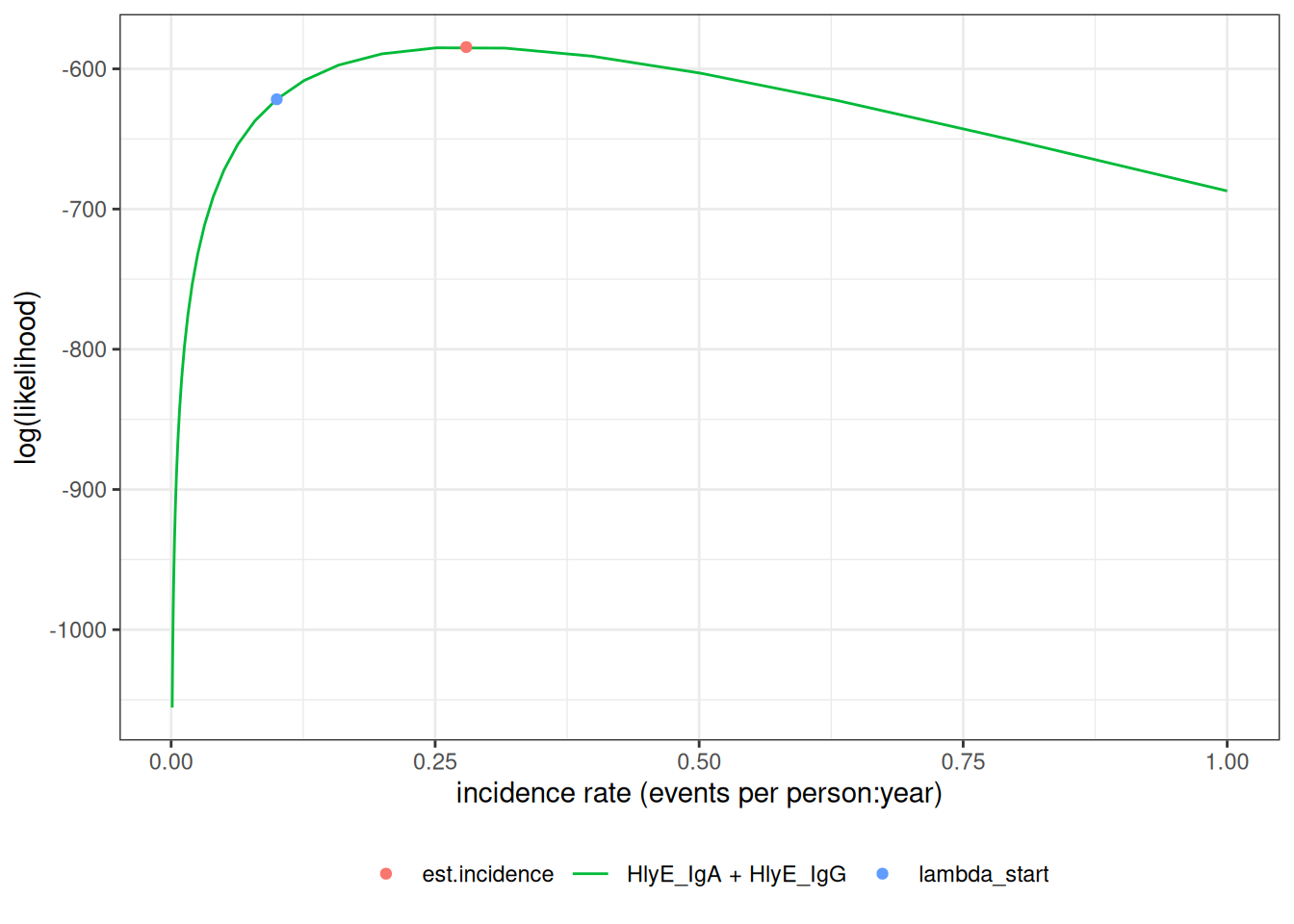
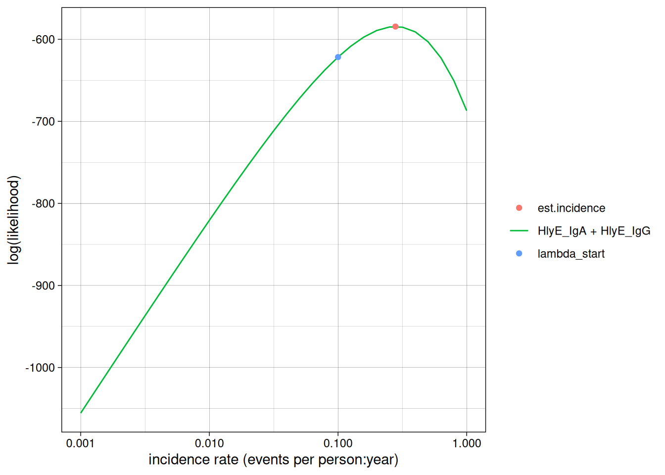
We can set the x-axis to a logarithmic scale:
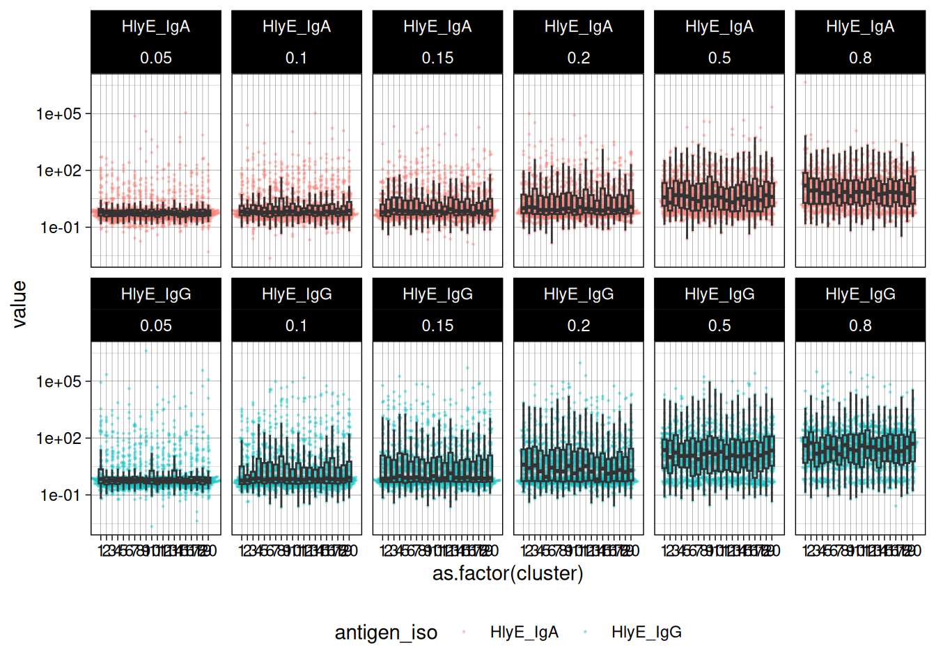
2 Simulate multiple clusters with different lambdas
#> [1] 3In the preceding code chunk, we have determined that we can use 3 CPU cores to run computations in parallel.
#> # A tibble: 24,000 × 7
#>      age id    antigen_iso value lambda.sim sample_size cluster
#>    <dbl> <chr> <chr>       <dbl>      <dbl>       <dbl>   <int>
#>  1  3.53 1     HlyE_IgA    0.725       0.05         100       1
#>  2  3.53 1     HlyE_IgG    0.749       0.05         100       1
#>  3  2.27 2     HlyE_IgA    0.647       0.05         100       1
#>  4  2.27 2     HlyE_IgG    0.382       0.05         100       1
#>  5  9.05 3     HlyE_IgA    0.176       0.05         100       1
#>  6  9.05 3     HlyE_IgG    0.585       0.05         100       1
#>  7  5.94 4     HlyE_IgA    0.845       0.05         100       1
#>  8  5.94 4     HlyE_IgG    0.744       0.05         100       1
#>  9  9.88 5     HlyE_IgA    0.644       0.05         100       1
#> 10  9.88 5     HlyE_IgG    0.292       0.05         100       1
#> # ℹ 23,990 more rows
We can plot the distributions of the simulated responses:
2.1 Estimate incidence in each cluster
summary(ests) produces a tibble() with some extra meta-data:
#> Seroincidence estimated given the following setup:
#> a) Antigen isotypes   : HlyE_IgG, HlyE_IgA
#> b) Strata       : sample_size, lambda.sim, cluster
#>
#>  Seroincidence estimates:
#> # A tibble: 120 × 16
#>    Stratum sample_size lambda.sim cluster     n est.start incidence.rate      SE
#>    <chr>         <dbl>      <dbl>   <int> <int>     <dbl>          <dbl>   <dbl>
#>  1 Stratu…         100       0.05       1   100       0.1         0.0853 0.0124
#>  2 Stratu…         100       0.05       2   100       0.1         0.0480 0.00863
#>  3 Stratu…         100       0.05       3   100       0.1         0.0537 0.00899
#>  4 Stratu…         100       0.05       4   100       0.1         0.0432 0.00834
#>  5 Stratu…         100       0.05       5   100       0.1         0.0455 0.00824
#>  6 Stratu…         100       0.05       6   100       0.1         0.0630 0.0105
#>  7 Stratu…         100       0.05       7   100       0.1         0.0622 0.0101
#>  8 Stratu…         100       0.05       8   100       0.1         0.0470 0.00844
#>  9 Stratu…         100       0.05       9   100       0.1         0.0338 0.00722
#> 10 Stratu…         100       0.05      10   100       0.1         0.0714 0.0108
#> # ℹ 110 more rows
#> # ℹ 8 more variables: CI.lwr <dbl>, CI.upr <dbl>, se_type <chr>,
#> #   coverage <dbl>, log.lik <dbl>, iterations <int>, antigen.isos <chr>,
#> #   nlm.convergence.code <ord>
We can explore the summary table interactively using DT::datatable()
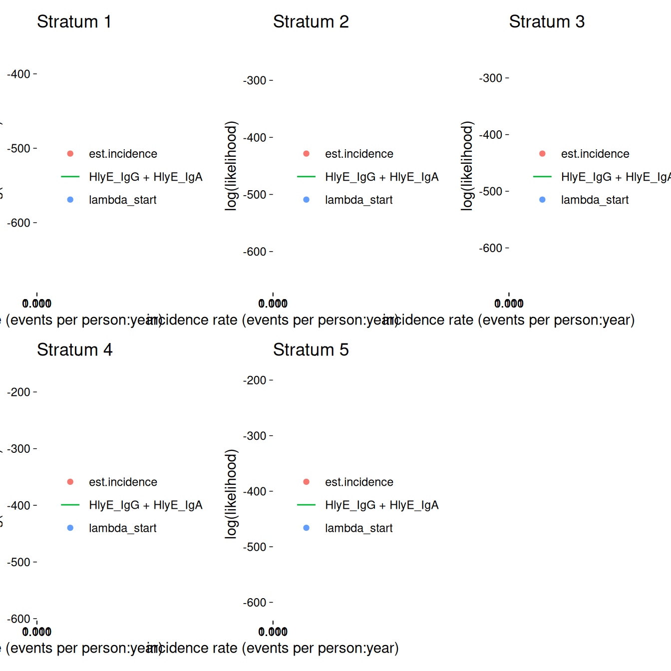
We can plot the likelihood for a single simulated cluster by subsetting that simulation in ests and calling plot():
We can also plot log-likelihood curves for several clusters at once (your computer might struggle to plot many at once):
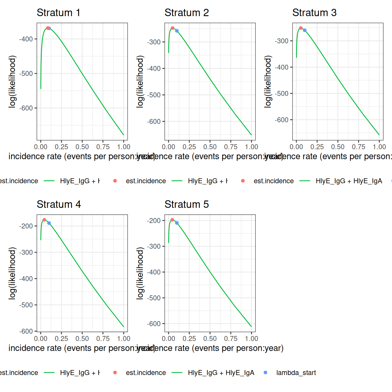
The log_x argument also works here:
2.1.1 nlm() convergence codes
Make sure to check the nlm() exit codes (codes 3-5 indicate possible non-convergence):
#> # A tibble: 8 × 2
#>   Stratum     nlm.convergence.code
#>   <chr>       <ord>
#> 1 Stratum 10  3
#> 2 Stratum 23  3
#> 3 Stratum 27  3
#> 4 Stratum 44  3
#> 5 Stratum 48  3
#> 6 Stratum 61  3
#> 7 Stratum 95  3
#> 8 Stratum 105 3
Solutions to nlm() exit codes 3-5:
- 3: decrease the
stepminargument toest_seroincidence()/est_seroincidence_by() - 4: increase the
iterlimargument toest_seroincidence()/est_seroincidence_by() - 5: increase the
stepmaxargument toest_seroincidence()/est_seroincidence_by()
We can extract the indices of problematic strata, if there are any:
#> [1] 10 23 27 44 48 61 95 105If any clusters had problems, we can take a look:
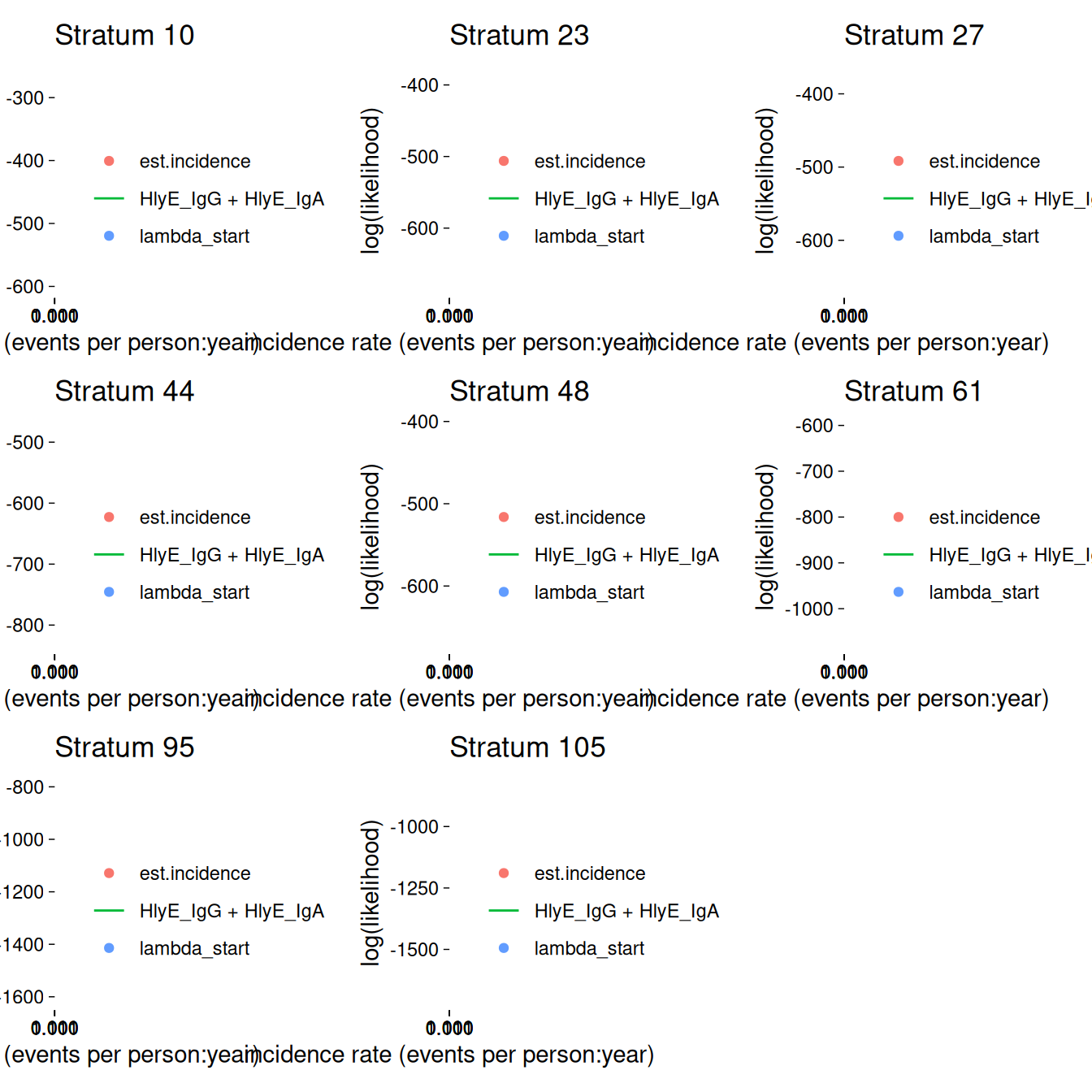
If any of the fits don’t appear to be at the maximum likelihood, we should re-run those clusters, adjusting the nlm() settings appropriately, to be sure.
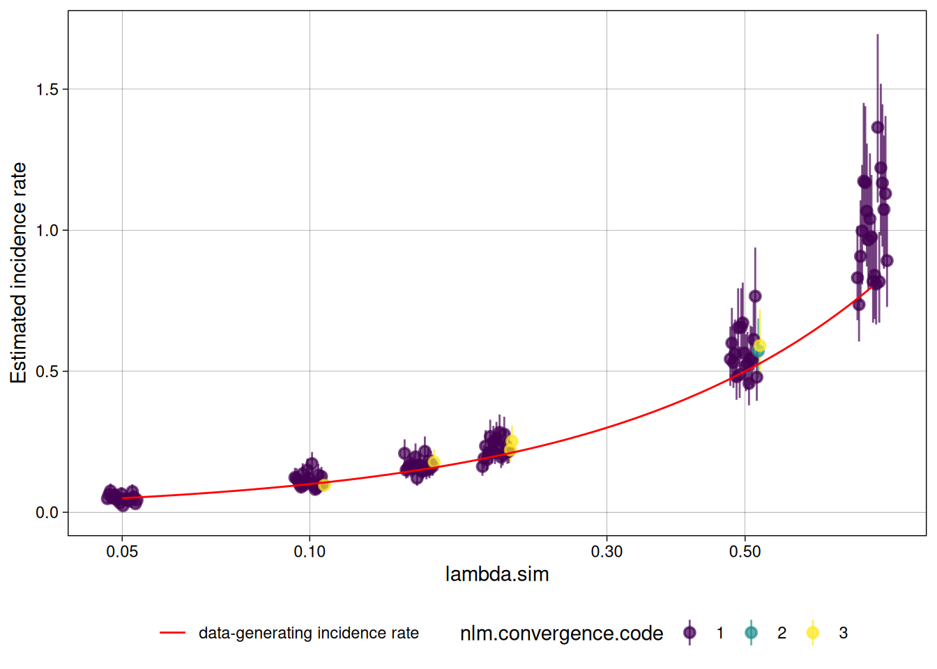
2.2 plot distribution of estimates by simulated incidence rate
Finally, we can look at our simulation results:
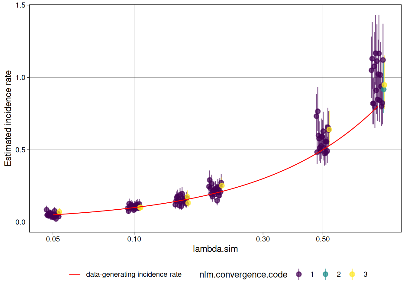
We can analyze the simulation results with analyze_sims():
#> # A tibble: 6 × 8
#>   lambda.sim sample_size     Bias Mean_Est_SE Empirical_SE   RMSE Mean_CI_Width
#>        <dbl>       <dbl>    <dbl>       <dbl>        <dbl>  <dbl>         <dbl>
#> 1       0.05         100 0.000864     0.00887       0.0158 0.0155        0.0355
#> 2       0.1          100 0.00486      0.0141        0.0137 0.0142        0.0559
#> 3       0.15         100 0.00142      0.0182        0.0240 0.0234        0.0720
#> 4       0.2          100 0.0228       0.0240        0.0350 0.0411        0.0949
#> 5       0.5          100 0.0749       0.0556        0.0831 0.110         0.219
#> 6       0.8          100 0.166        0.0980        0.132  0.210         0.387
#> # ℹ 1 more variable: CI_Coverage <dbl>
We can graph the analysis results with an autoplot() method:
#> `geom_line()`: Each group consists of only one observation.
#> ℹ Do you need to adjust the group aesthetic?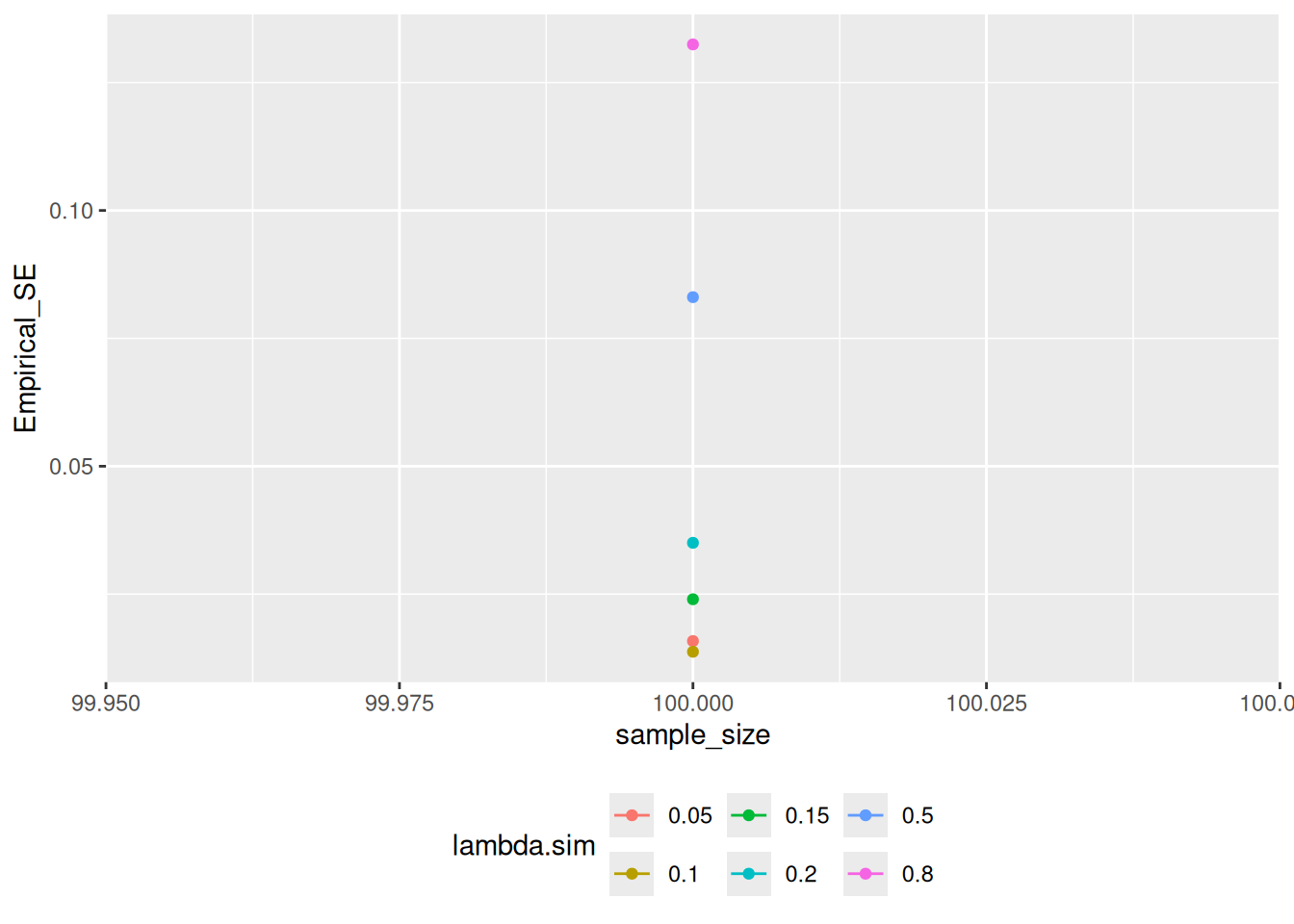
2.3 Effect of renew_params
Setting renew_params = TRUE is more realistic, but not is accounted for by the current method; for population samples from populations with high incidence rates, there may be bias: