Plot the log-likelihood curve for the incidence rate estimate

Description

Plot the log-likelihood curve for the incidence rate estimate

Usage

## S3 method for class 'seroincidence'
autoplot(object, log_x = FALSE, ...)

Arguments

object a seroincidence object (from est_seroincidence())
log_x should the x-axis be on a logarithmic scale (TRUE) or linear scale (FALSE, default)?
unused

Value

a ggplot2::ggplot()

Examples

Code
library("serocalculator")


library(dplyr)
library(ggplot2)

xs_data <-
  sees_pop_data_pk_100

curve <-
  typhoid_curves_nostrat_100 %>%
  filter(antigen_iso %in% c("HlyE_IgA", "HlyE_IgG"))

noise <-
  example_noise_params_pk

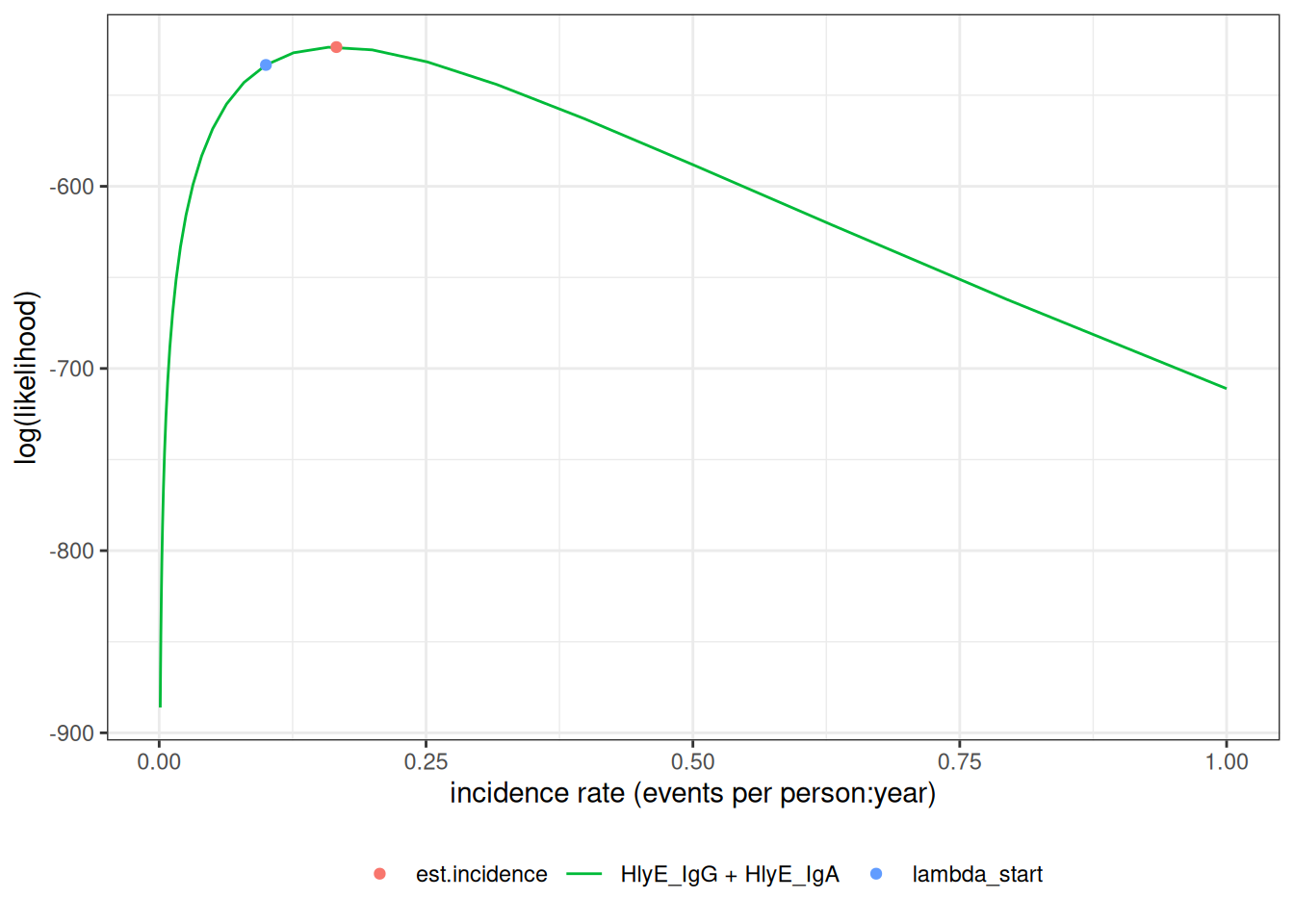
est1 <- est_seroincidence(
  pop_data = xs_data,
  sr_param = curve,
  noise_param = noise,
  antigen_isos = c("HlyE_IgG", "HlyE_IgA"),
  build_graph = TRUE
)

# Plot the log-likelihood curve
autoplot(est1)