Generate Predicted Antibody Response Curves (Median + 95% CI)
Source:R/plot_predicted_curve.R
plot_predicted_curve.RdPlots a median antibody response curve with a 95% credible interval ribbon, using MCMC samples from the posterior distribution. Optionally overlays observed data, applies logarithmic spacing on the y- and x-axes, and shows all individual sampled curves.
Usage
plot_predicted_curve(
  model,
  ids,
  antigen_iso,
  dataset = NULL,
  legend_obs = "Observed data",
  legend_median = "Median prediction",
  show_quantiles = TRUE,
  log_y = FALSE,
  log_x = FALSE,
  show_all_curves = FALSE,
  alpha_samples = 0.3,
  xlim = NULL,
  ylab = NULL,
  facet_by_id = length(ids) > 1,
  ncol = NULL
)
Arguments
- model
An
sr_modelobject (returned by run_mod) containing samples from the posterior distribution of the model parameters.- ids
The participant IDs to plot; for example,
"sees_npl_128".- antigen_iso
The antigen isotype to plot; for example, "HlyE_IgA" or "HlyE_IgG".
- dataset
(Optional) A tibble::tbl_df with observed antibody response data. Must contain:
timeindaysvalueidantigen_iso
- legend_obs
Label for observed data in the legend.
- legend_median
Label for the median prediction line.
- show_quantiles
logical; if TRUE (default), plots the 2.5%, 50%, and 97.5% quantiles.
- log_y
logical; if TRUE, applies a log10 transformation to the y-axis.
- log_x
logical; if TRUE, applies a log10 transformation to the x-axis.
- show_all_curves
- alpha_samples
Numeric; transparency level for individual curves (default = 0.3).
- xlim
(Optional) A numeric vector of length 2 providing custom x-axis limits.
- ylab
(Optional) A string for the y-axis label. If
NULL(default), the label is automatically set to "ELISA units" or "ELISA units (log scale)" based on thelog_yargument.- facet_by_id
logical; if TRUE, facets the plot by 'id'. Defaults to TRUE when multiple IDs are provided.
- ncol
integer; number of columns for faceting.
Value
A ggplot2::ggplot object displaying predicted antibody response curves with a median curve and a 95% credible interval band as default.
Examples
sees_model <- serodynamics::nepal_sees_jags_output
sees_data <- serodynamics::nepal_sees
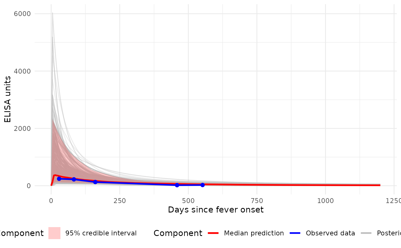
# Plot (linear axes) with all individual curves + median ribbon
p1 <- plot_predicted_curve(
model = sees_model,
dataset = sees_data,
id = "sees_npl_128",
antigen_iso = "HlyE_IgA",
show_quantiles = TRUE,
log_y = FALSE,
log_x = FALSE,
show_all_curves = TRUE
)
print(p1)
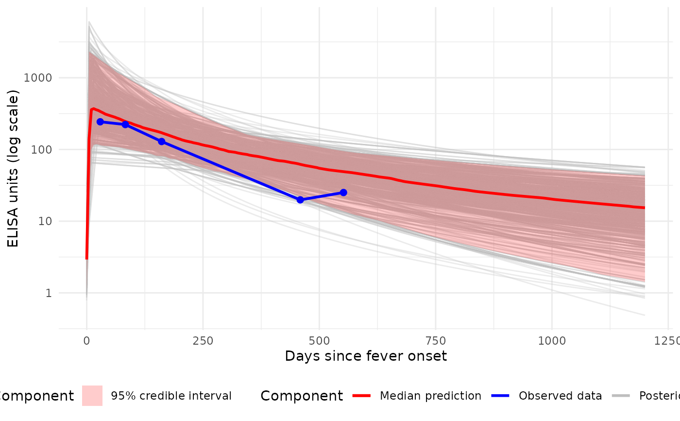
 # Plot (log10 y-axis) with all individual curves + median ribbon
p2 <- plot_predicted_curve(
model = sees_model,
dataset = sees_data,
id = "sees_npl_128",
antigen_iso = "HlyE_IgA",
show_quantiles = TRUE,
log_y = TRUE,
log_x = FALSE,
show_all_curves = TRUE
)
print(p2)
# Plot (log10 y-axis) with all individual curves + median ribbon
p2 <- plot_predicted_curve(
model = sees_model,
dataset = sees_data,
id = "sees_npl_128",
antigen_iso = "HlyE_IgA",
show_quantiles = TRUE,
log_y = TRUE,
log_x = FALSE,
show_all_curves = TRUE
)
print(p2)
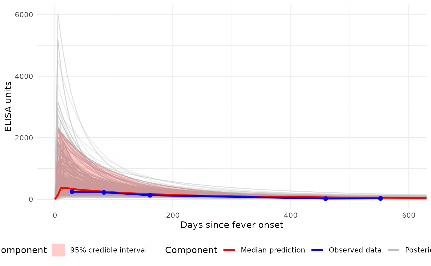
 # Plot with custom x-axis limits (0-600 days)
p3 <- plot_predicted_curve(
model = sees_model,
dataset = sees_data,
id = "sees_npl_128",
antigen_iso = "HlyE_IgA",
show_quantiles = TRUE,
log_y = FALSE,
log_x = FALSE,
show_all_curves = TRUE,
xlim = c(0, 600)
)
print(p3)
# Plot with custom x-axis limits (0-600 days)
p3 <- plot_predicted_curve(
model = sees_model,
dataset = sees_data,
id = "sees_npl_128",
antigen_iso = "HlyE_IgA",
show_quantiles = TRUE,
log_y = FALSE,
log_x = FALSE,
show_all_curves = TRUE,
xlim = c(0, 600)
)
print(p3)
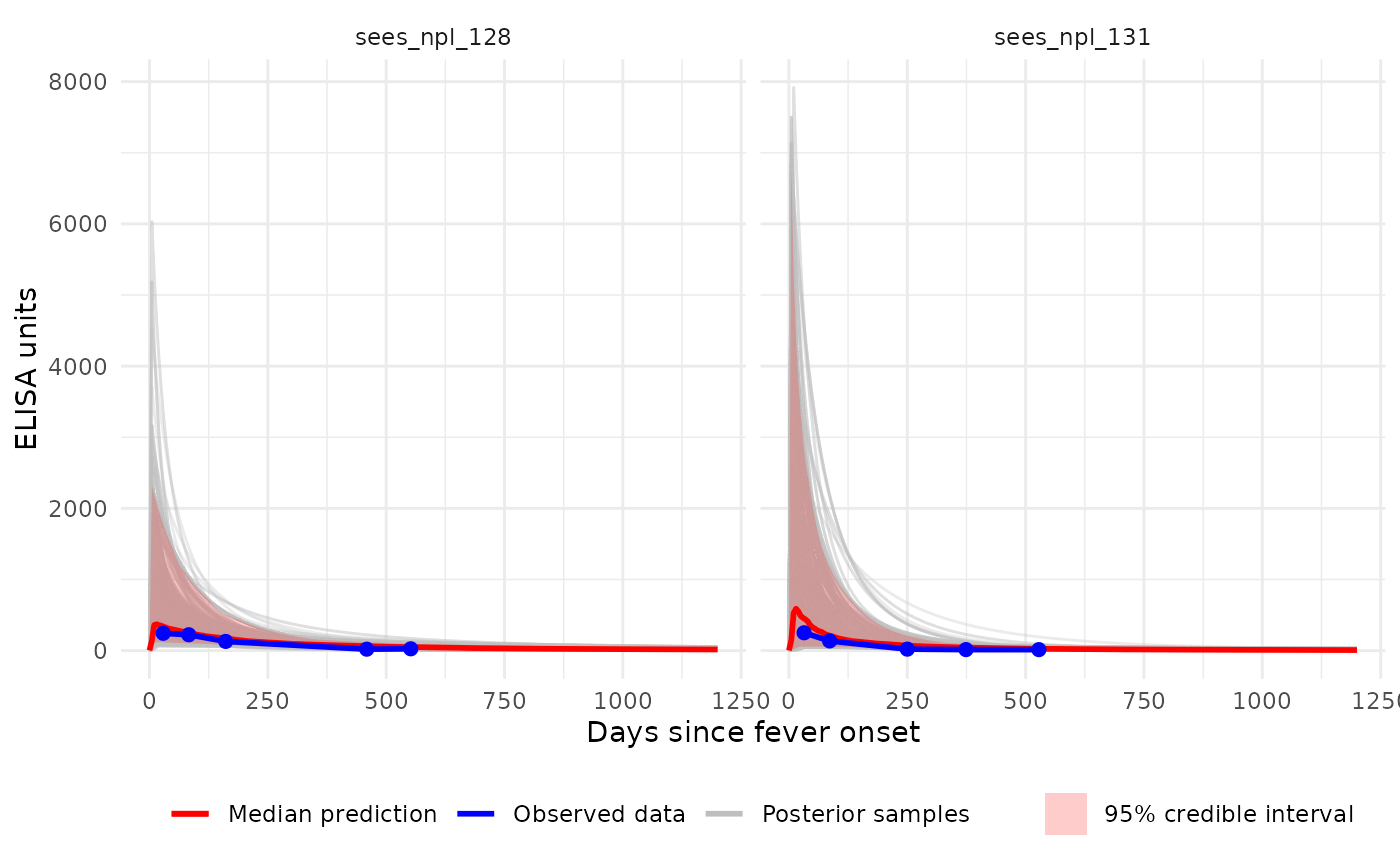
 # Multi-ID, faceted plot (single antigen):
p4 <- plot_predicted_curve(
model = sees_model,
dataset = sees_data,
id = c("sees_npl_128", "sees_npl_131"),
antigen_iso = "HlyE_IgA",
show_all_curves = TRUE,
facet_by_id = TRUE
)
print(p4)
# Multi-ID, faceted plot (single antigen):
p4 <- plot_predicted_curve(
model = sees_model,
dataset = sees_data,
id = c("sees_npl_128", "sees_npl_131"),
antigen_iso = "HlyE_IgA",
show_all_curves = TRUE,
facet_by_id = TRUE
)
print(p4)