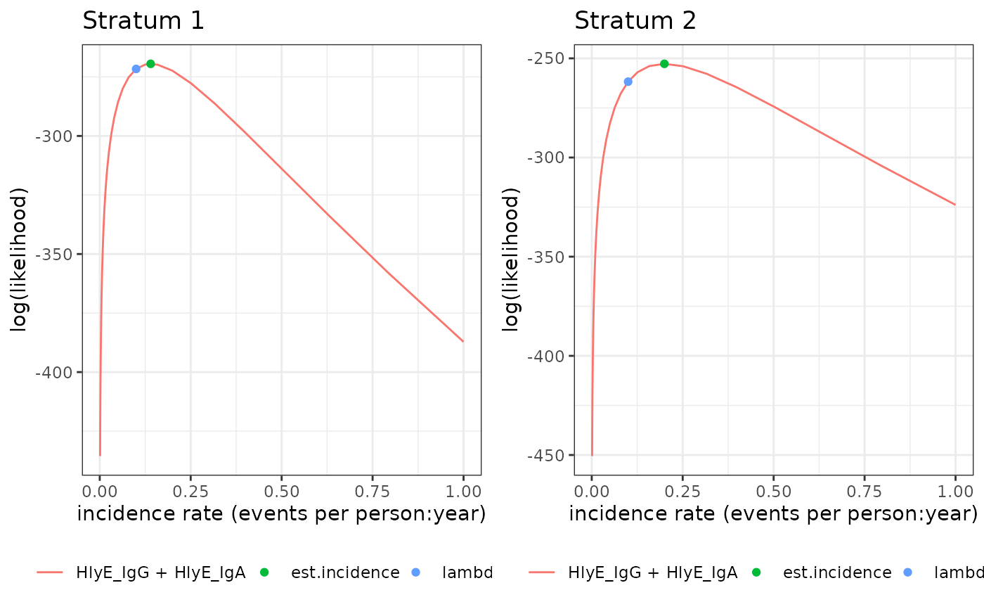
Plot seroincidence.by log-likelihoods
Source: R/autoplot.seroincidence.by.R
autoplot.seroincidence.by.RdPlots log-likelihood curves by stratum, for seroincidence.by objects
Arguments
- object
a '"seroincidence.by"' object (from
est_seroincidence_by())- ncol
number of columns to use for panel of plots
- ...
-
Arguments passed on to
autoplot.seroincidencelog_xshould the x-axis be on a logarithmic scale (
TRUE) or linear scale (FALSE, default)?
Value
a "ggarrange" object: a single or list() of ggplot2::ggplot()s
Examples
# \donttest{
library(dplyr)
library(ggplot2)

xs_data <-
  sees_pop_data_pk_100

curve <-
  typhoid_curves_nostrat_100 %>%
  filter(antigen_iso %in% c("HlyE_IgA", "HlyE_IgG"))

noise <-
  example_noise_params_pk

est2 <- est_seroincidence_by(
  strata = c("catchment"),
  pop_data = xs_data,
  sr_params = curve,
  curve_strata_varnames= NULL,
  noise_strata_varnames = NULL,
  noise_params = noise,
  antigen_isos = c("HlyE_IgG", "HlyE_IgA"),
  #num_cores = 8, #Allow for parallel processing to decrease run time
  build_graph = TRUE
)

# Plot the log-likelihood curve
autoplot(est2)

# }
# }